Settings and search
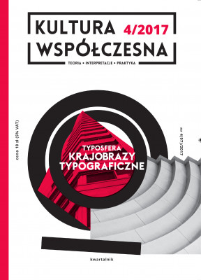
Typosphere. Typographic landscapes


Table of contents
I TYPOSPHERE. TYPOGRAPHIC LANDSCAPES
Agnieszka Karpowicz, Marta Rakoczy
Introduction. Typographic landscapes
Agata Szydłowska
Philanthropists and apologists. Typopolo as a tool of social distinction
Marta Rakoczy
Between the image and the letter, between the sight and the touch – a sketch on kindergarten typography
Sylwia Chutnik
“Sorry for scribbles”. Typography and topography of women’s zines
Agnieszka Karpowicz
What does your t-shirt say when you stay silent?
Jerzy Stachowicz
Sherlock – scriptural mind amongst the new media. New role of film subtitles
Nicole Dołowy-Rybińska
Language landscapes of European language minorities: meaning, role, challenges
Joanna Kocon
Experimental typographic walk around Zgorzelec and Görlitz
Weronika Parfianowicz-Vertun
The most humble typography. On the typography of housing estates
Xawery Stańczyk
Guerrilla commercial communication. Ad busting and destroying adverts as a social resistance to commercialization of urban space
II EXPERIENCING SPACE
Aleksandra Żukowska
In the spirit of modernism. Typography in public space of Gdynia – roots, inspirations, contemporary history
Ewa Kępa
Alternative knitting. Knitting graffiti as a creative practice of constructing social reality
Magdalena Link-Lenczowska
The function of seeing in the quince tree sun by Víctor Erice in the context of Juhany Pallasmaa’s haptic perception
III REVIEWS
Ilona Copik
Return to sources: place – human – locality
Typosphere. Typographic landscapes
Introduction. Typographic landscapes
- Agnieszka Karpowicz, Marta Rakoczy
The text analyses professional reception of a phenomenon called TypoPolo. Being a part of vernacular typography, the term defines a particular kind of urban lettering and signage found in Polish towns, which can become a subject of criticism, as well as a source of fascination for professional designers. Referring to sociological analyses of the so-called collateral culture and ethnological discourses’ critique, the text states that inspiration taken from TypoPolo style in professional design has its use in modernisation discourse critique. The critique itself takes place at the expense of creation and insrumentalization of The Other One – an uneducated small business operator, and his clients.
The article focuses on analysing a couple of phenomena connected with typographic kindergarten education. Contrary to the classical view on the theory of literacy, I was trying to show how the image and the printed word can be based on similar strategies of both visual and sensual representations, and how these strategies are creatively transformed by different means of typographic activities, which eventually results in constitution of various literacy policies.
The article analyses aesthetics, particularly highlighting the typeface used, of alternative female magazines. The main focus is on the zines’ connection with the feminist movement. Also, the author compares Polish and American independent publications and explains literary practices of the riot grrrl movement.
The article analyses a popular contemporary practise of placing writings on clothes (especially t-shirts). The author tries to answer a question why printed words turn out to be the means of expression adequate to meet communication needs, and consequently – identity and social needs of post-topographic culture participants.
The article describes changes in the topographic sphere of film, giving the example of British series Sherlock, one of the first TV productions with a new artistic convention using classical film subtitles. This effort to analyse Sherlock’s typographic sphere is also used to present other changes, which take place in communication amongst people of the smartphone era.
The article presents certain aspects of top-down and bottom-up language policy in the context of shaping the landscape of bilingual regions and their role in enhancing language prestige and breaking the dominance of formal culture. Also, the processes of politicization of ethnicity and the minorities’ action of constructing ethnic boundaries in order to take over public space for the use of minority language are discussed. The final part of the article refers to the relationship between the visual presence of minority languages within the cultural landscape, and the reversal of language shift.
The purpose of the article is to find out – by analysing the inhabitants’ typographic practices – if urban lettering of public and semi-private spaces has any connection with the character of a particular place. Typographical features of Zgorzelec in Poland and Goerlitz in Germany have been compared. The two cities had had a mutual history, which has come to an end after WWII.
The article focuses on the typosphere of housing estates. Using the example of one such typical space, distinctive typographic practices are analysed: services points’ signs, advertising media, noticeboards, pin boards, notifications left in staircases and corridors, created by and for local residents. Particular stress has been laid on grass roots and non-professional practices, as well as on the act of interpreting signs and writings with the use of anthropological tools, the writings’ function and reception.
The article presents contemporary ad busting and anti-advertising practices as ways of expressing social resistance and reclaiming the city by its residents and users. Contexts create classical concepts and definitions of ad busting, subvertising, cultural provocation and visual pollution, as well as the history of anti-consumerism actions in the 1980’s up until now. Alongside the artistic and activist examples of guerrilla commercial communication, its vernacular forms have been presented.
Experiencing space
Typography in the Polish public space has been changing dynamically since the 1990’s. Alongside TypoPolo, which has stemmed from developing capitalism, many carefully designed projects are born, connected with the history of a certain place and consciously shaping its contemporary identity. Craftsmen’s services advertising signs can be an example here. The city of Gdynia is a unique phenomenon. In recent years more and more typographic features have appeared in the city’s landscape, creating its visual identity, yet showing appropriate respect for the architecture’s dominant modernist style. Original signs inspired by inter-war and postwar period aesthetics, neon signs, typography as a part of architecture – all create a sense of concise urban policy, also supporting the actions of typoactivists. The relationship between the tradition of modernism and contemporary typographic designs is closely analysed, bearing in mind Gdynia’s political context in creating the city’s image and prestige.
Knitting graffiti is a cultural practice, whose key feature is active construction of urban landscape. The article tries to explain the complex messages behind the actions of those who fill the urban space with handmade knitwear. Yarn-made graffiti deconstructs symbolic meanings of this artistic handcraft, traditionally made by women in private space. It also becomes a tool of creative expression and inspires activists to make the world a better place.
The text uses Juhany Pallasmaa’s phenomenological theory of architecture as a way of broadening the sensuous film theory methodology, with the aim of testing the possibility of haptic seeing in cinematography. The Quince Tree Sun directed by Víctor Erice becomes a source for investigating ways of perception other than visual within the space of inner- and outer-diegesis. The article also analyses intertextual relations of painting and film media, the status of images they produce, as well as co-dependence of the protagonist, the author and the viewer in experiencing reality through art.
